Available, published 5 years ago
Feature Prioritization Quadrant Chart
Not all feature ideas are equal. Productific displays charts to identify the most attractive features comparing voting trends.
Feature voting identifies the most attractive ideas for product enhancements by user voting. Feature voting can be used for mobile apps, games, business software or any other product that benefits from happy user.
To support the owner in deciding what to build next we make feature voting results visually accessible, as a chart.
In this chart, the feature voting results are mapped in "trending" vs. "all-time". The owner of a product can identify trending items and also see how they relate to all-time most upvoted items. The owner needs to look at both:
- trending items which recently many votes (past 30 days and past 90 days)
- all-time high items which collected the most overall votes and represent users' favourites
Usually, ideas are listed for voting at different times. Example: while idea #1 is an old one and up for voting since last year, idea #2 is listed for two months only and has not yet collected as many votes. Though, in the past days idea #2 has collected significant votes which identifies it as an attractive idea.
We display the following chart:
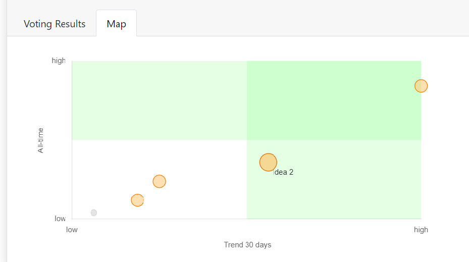
The x-axis shows how many votes an idea received in the past 90 days. The y-axis shows overall votes. Trending items are towards the right, overall winners towards the top.
The red items are top-voted 'winners': they received most votes in the past 90 days and also overall:
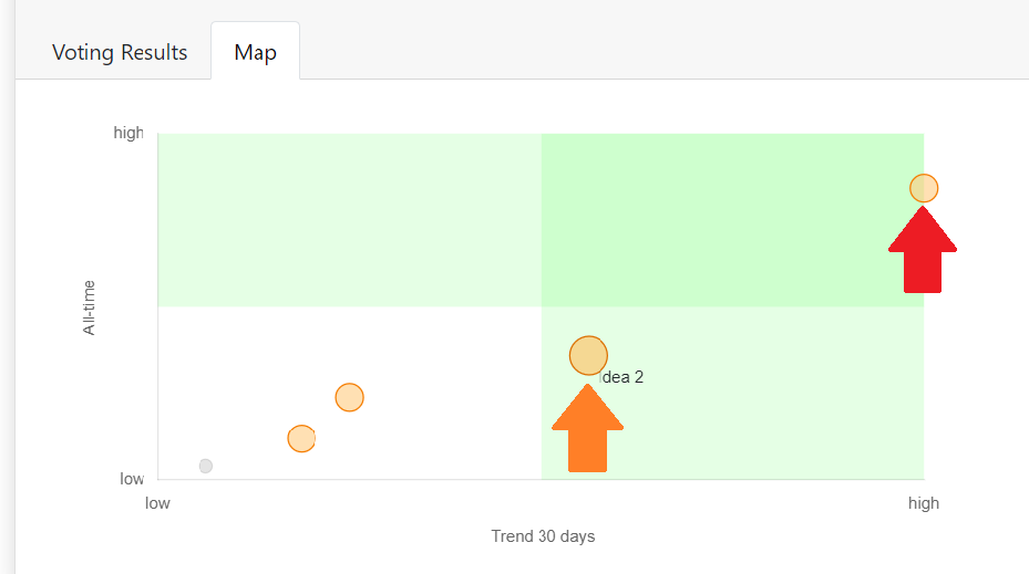
The orange item, though, have not received an outlier-number of overall votes. However, looking at the trend of the past 90 days, they can be easily identified as an attractive feature to users, too.
Summary: Besides showing top ranked ideas, the Productific dashboard displays charts to identify the most attractive items on a map:
- all-time vs. 30 days trend
- all-time vs. 90 days trend
- 30 vs. 90 days trend